User generated curation at the Met
As one Met visitor says, “It’s fun to compare completely di erent types of art.” Yet exhibitions at the Metropolitan Museum traditionally focus on a single artist, style, geography, or time period. How might we create a mobile experience that allows users to view artwork both horizontally (making connections between culture, time and place) and vertically (looking at different types of art within a single culture, time, or place)?
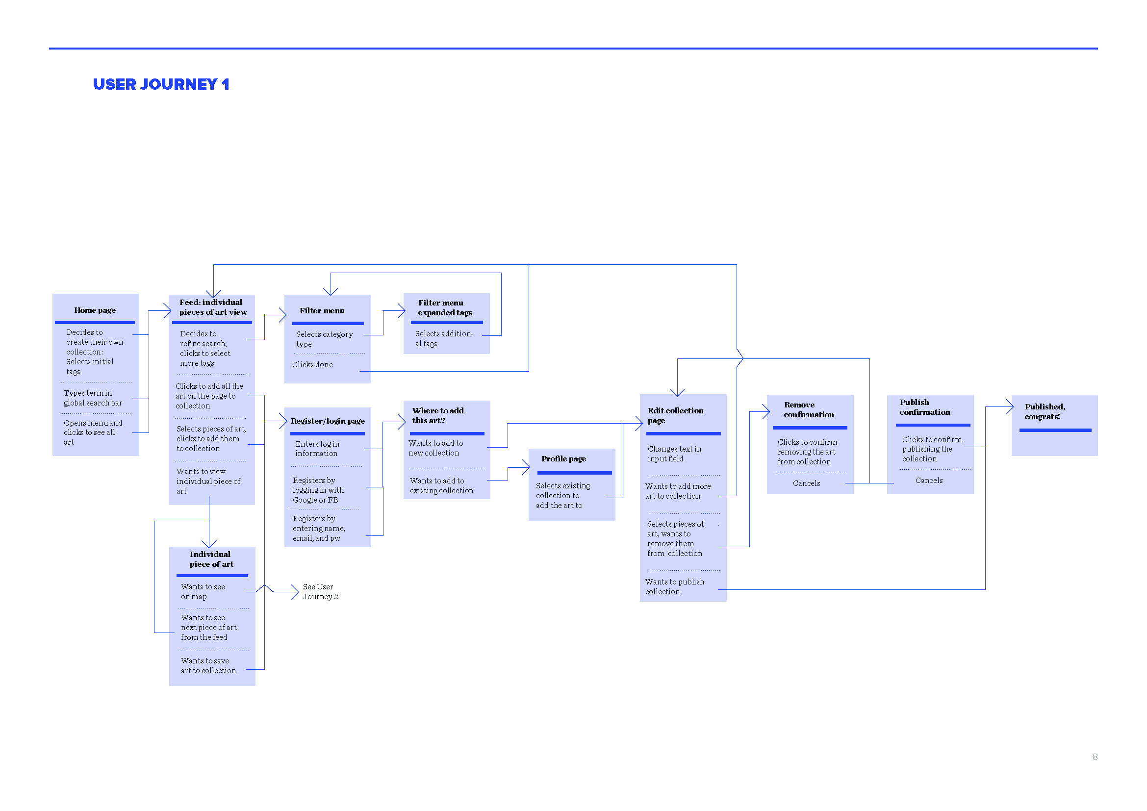
During a certificate course in mobile user experience design at Pratt Institute, I conducted user research through contextual interviews, social media analysis, competitive analyses, and a card sorting exercise to design a prototype for an app to be used by the Metropolitan Museum of Art.
Site map, user flows, and wireframes
Personas generated from user interviews:
Excerpts from social media analysis:
Competitive analysis:
Results from card-sorting exercise with users:


